How To Create Reports in IntegrityCounts Insights
Quick Reference
IntegrityCounts Insights transforms your case data into visual dashboards you can filter, download, and share. Use it to spot trends, prepare board reports, and demonstrate your compliance program's impact.
| Insights Reports (PDF) | Case Manager Reports (CSV) |
|---|---|
| Visual dashboards with pie charts and bar graphs | Raw tabular data you can analyze in Excel |
| Best for board presentations, audit evidence, and trend spotting | Best for custom calculations like average resolution time |
| Covered in this article | Learn more about Case Manager Reports |
Why Insights Matters
While Case Manager lets you handle individual reports, Insights turns that data into strategic intelligence. It moves your organization from reactive case management to proactive culture building.
- Identify systemic issues: Spot patterns, like a spike in harassment reports in a specific location, before they escalate.
- Allocate resources: See which departments generate the most volume so you can target training where it matters.
- Demonstrate program health: Generate visual evidence of your compliance program's activity and responsiveness for board meetings, audits, or leadership reviews.
Accessing Insights and Filtering Your Data
Opening the Dashboard
Click the Insights button in the top navigation bar, next to Case Manager.
Filtering Your Data
Data is only useful when it's relevant. Insights uses the same filtering engine as Case Manager, so you can slice your data to answer specific questions like "How many safety incidents occurred in the West Coast branch this quarter?"
Use the filter bar at the top to narrow by date range, location, department, case type, anonymity level, source, priority, status, outcomes, or tags.
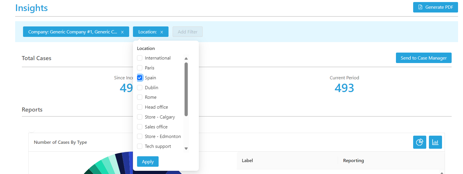
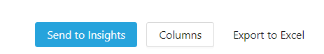
Tip: If you have already built a filtered view in Case Manager, you don't need to rebuild it. Click the Send to Insight button in Case Manager to transfer your current filters directly to the Insights dashboard.
Choosing Your Visualization
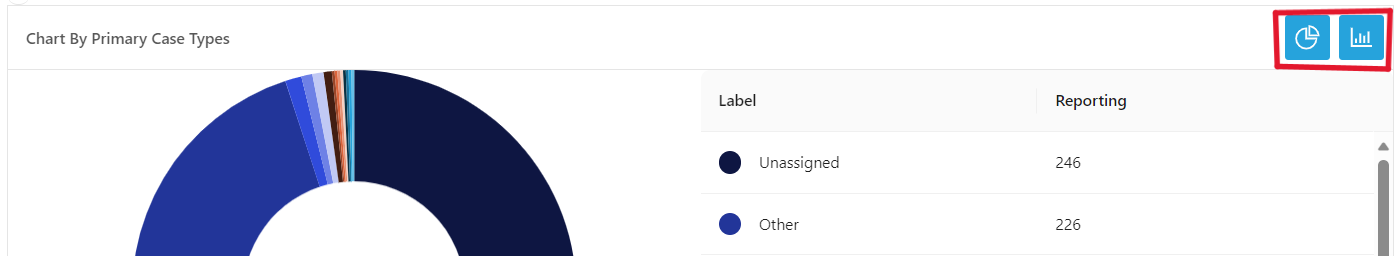
Different data tells different stories depending on how it's presented. You can toggle each widget between two views:
- Pie charts: Best for seeing proportions (e.g., what percentage of cases are anonymous vs. identified).
- Bar graphs: Best for comparing volumes (e.g., which month had the highest number of reports).
What You Can See in Insights
Insights provides visual breakdowns across every major dimension of your case data. Here's what each section covers:
| Metric | What It Shows You |
|---|---|
| Total Cases | Overall case volume for your selected date range |
| Case Types | Distribution of case types (e.g., Harassment, Fraud, Conflict of Interest). Shows both primary case type and all linked types when multiple apply. |
| Location | Case volume by location, so you can identify regional patterns |
| Department | Case volume by department, helping you target training and resources |
| Anonymity | Breakdown of Strictly Anonymous, Anonymous from Organization, and Contact Information Provided |
| Source | How cases were submitted (online portal vs. filed by proxy) |
| Priority | Distribution across priority levels (Normal, High, Urgent) |
| Status | Snapshot of case statuses (Pending, Responded, Assigned, Closed) |
| Aging (Days Open) | How long cases have been open, helping you identify bottlenecks |
| Outcomes | Validation results (Substantiated, Partially Substantiated, Unsubstantiated) and Action types (Corrective Action, Coaching/Training, Policy Revision, Termination, etc.) |
| Tags | Any custom tags your team has applied, giving you flexible tracking beyond standard fields |
All of these can be filtered by date range, so you can compare year over year by adjusting the time window.
Generating PDF Reports
For ad-hoc meetings, audit requests, or quick board updates, you can download a visual summary of your current view instantly.
Click Generate PDF in the top right corner. The system creates a professional PDF reflecting your current filters and chart selections (pie or bar). What you see on screen is exactly what appears in the PDF.

Scheduling Automated Insights Reports
Instead of logging in and generating reports manually, you can schedule Insights to deliver visual PDF reports to your team automatically. This keeps stakeholders informed on a consistent cadence without any extra effort.
Step 1: Set Your Filters
Apply the filters you want in the dashboard first. Your scheduled report will use these same filters every time it runs.
Step 2: Open the Scheduling Menu
Click Insights Report at the top of the page, then select Schedule Report.


Step 3: Name and Set Frequency
Give the report a clear, descriptive name (e.g., "Monthly Safety Trends" or "Q1 Board Summary"). Choose a delivery frequency: Daily, Weekly, Monthly, or Quarterly.


Step 4: Add Recipients
Add internal investigators, managers, or external partners (such as legal counsel or auditors) to the distribution list.

Built-in security: IntegrityCounts automatically enforces conflict of interest protocols. If a manager receiving a scheduled report is implicated in a specific case, that case is automatically excluded from their version of the report. You can automate reporting without risking confidentiality breaches.
Step 5: Activate
Click Send Test Email to preview the output, then click Schedule Report to activate.

Key Takeaways
Insights gives you visual dashboards covering every dimension of your case data: case types, locations, departments, anonymity, outcomes, aging, and more. Filter by date range to compare trends over time. Generate PDFs on demand or schedule automated delivery to your team.
For raw data you can analyze in Excel, including custom calculations like average resolution time, use Case Manager exports instead.